Brace yourself!

Yes, AOL Is Still Around—And It Has a Controversial New Look

AOL, formerly known as America Online (and your favorite instant messaging system of the ’90s), is causing quite a stir on the internet right now. The reason? It just underwent an impromptu logo change. And while the changes may seem minor to bystanders, longtime AOL users have a lot to say about it.
We know what you’re thinking: Does anyone actually use AOL anymore? Based on the response from AOL fans, apparently, yes, it’s still a thing! And no, this logo didn’t bring back the “yellow running man” from your AIM days … at least, not in the way that you think.
So what’s going on? Read on to find out all about AOL’s most recent logo evolution, the reasons behind it and a little trip down memory lane. Flannel shirts and glitter body wash optional.
Get Reader’s Digest’s Read Up newsletter for more news, tech, travel, cleaning, humor and fun facts all week long.
How did AOL revamp its logo?
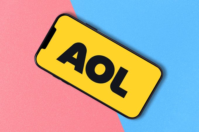
This is a bit of a trick question because the AOL logo launch occurred in two phases. Phase 1, in December, involved its font and lettering. The first logo change in 15 years, AOL ditched the lowercase o and l, as well as the iconic period at the end of the trademark. It now features all uppercase lettering and extra-bold sans serif font. The font remained black, while the background in the AOL app remained blue.
But it’s Phase 2, which made its big debut last month, that really has people in a tizzy. Are you ready for it? The blue-jay color of AOL’s app is now … bright mustard yellow.
What are people saying about this change?
Users may have been able to overlook the font change, but they are putting their collective foot down at the look-at-me yellow. The kinder words they’ve used to describe it? “Ugly,” “obnoxious,” “gross” and “bargain bin colored.”
“I hate the yellow. Please bring back the blue,” says one user on Facebook, while another complained, “Whoever decided the app should have an obnoxious bright yellow color made a big, annoying mistake.” And an X user who has been a loyal AOL devotee since the ’90s said, “Most of my jr high girl drama was carried out over AIM. I’ve stuck with them even when people give me a hard time about it. But AOL changing the color scheme of their app to yellow might be my jumping off point.”
There are a lone few, however, who don’t mind the new look. For instance, Mike Clark on X says, “I love the new yellow @AOL app. It seems as though 80% of my apps are blue. The new AOL logo sticks out like a sore thumb. Well done.” Or at least we think that’s a ringing endorsement.
Why did AOL do this?
While AOL didn’t make a statement about this change, the company seems to be taking a big step back from the outdated internet generation (think: dial-up internet and sketchy AOL chat rooms) and attempting to redefine itself for the modern age.
And as brand strategist Gwen Wunderlich notes, the yellow color does more than spark conversation, and this type of change is all about reengagement. “App icons today are overwhelmingly blue—Facebook, X, LinkedIn, PayPal—so by switching to a bright yellow, AOL becomes instantly visible again on crowded screens,” she says. “Change gets attention, even if it’s not positive.”
In fact, AOL has been in reboot mode for years. A little less than four years ago, Verizon sold AOL and Yahoo! to Apollo Global Management for $5 billion, a sum under half of the yearly revenue of both companies combined. Under new ownership, AOL funneled under the Yahoo! Inc umbrella. Now that Yahoo! is marking large returns, Apollo plans to continue growing Yahoo! Inc and make it a leading media brand once again. Hence, the rebrand.
Do people really hate the new look?
Well, yes, but it’s about more than just the color change. While it’s not uncommon for people to get their proverbial knickers in a twist when companies make even the slightest changes, the issue here may also have resulted from a disconnect in communication. “The problem with rebrands being ill-received has to do with companies forgetting they need to strategically ease their customers and followers into the new brand,” says brand designer Enid Casablanca, brand designer and consultant for the branding studio RAW Made. “You should have a launch plan that includes sequenced roll-out dates with preplanned teasers that alert your existing customers that something new is coming.”
So what is the symbolism behind AOL’s logo?
People are speculating that AOL’s bright new look may be a nod to the retired “yellow running man” from your AIM days who disappeared in 2017. The running man icon was based on postwar American trademarks in the 1940s and ’50s. And guess what—he’s suddenly reappeared at the top of AOL’s X profile, which Casablanca says is a big clue as to why they chose the bright yellow.
Beyond that, “yellow is a bold color,” says Wunderlich, noting that it evokes positive emotions such as energy, friendliness and urgency. Overall, she predicts that the yellow color is a callout to a younger audience.
Casablanca agrees and adds that the rounded-and-bolder text style of the new logo offers an invitation for younger generations, similar to Walmart’s recent rebrand: “My educated guess is that the color change is tied, in part, to an intention of reaching a new (younger) audience and competing in a market where modern tech brands are leaning toward youthful brand styles.”
What big changes have been made to the logo over the years?

America Online started out as Control Video Corporation in 1983 and changed its name to America Online in 1989. The first incarnation of the America Online logo (1989–1991) featured a triangle and a subdued brown color. Over the years, the color changed to blue and now black, the company has flip-flopped between American Online and AOL, and the arrow placement has moved around (though it disappeared in 2009, according to the site 1000 Logos). You can see a handy little evolution in the graphic above.
Ultimately, AOL is reinventing itself in 2025 in a way that’s hard to ignore—and that’s something Wunderlich applauds, calling this rebrand “a sign of life.” She sees this reengagement with the audience as a strong attempt to evolve, show up and commit. “And in today’s fast-paced world,” she says, “sometimes that’s the most powerful message of all.”
RELATED:
- 10 Reasons Your Home Internet Is So Slow—and How to Fix It
- This Map Shows the Fastest Internet Provider in Your Neighborhood
- Why You Should Be Putting Aluminum Foil Behind Your Router
Why trust us
At Reader’s Digest, we’re committed to producing high-quality content by writers with expertise and experience in their field in consultation with relevant, qualified experts. We rely on reputable primary sources, including government and professional organizations and academic institutions as well as our writers’ personal experiences where appropriate. We verify all facts and data, back them with credible sourcing and revisit them over time to ensure they remain accurate and up to date. Read more about our team, our contributors and our editorial policies.
Sources:
- USA Today: “‘Ewww:’ Is AOL yellow now? Users poke fun at new color scheme that ditched classic blue”
- Gwen Wunderlich, brand strategist and founder of The Founder’s Edit; interviewed, April 2025
- Enid Casablanca, brand designer and consultant for the branding studio RAW Made; interviewed, April 2025


